Analytics dashboard for tutoring companies

How can we inform companies about their
business strategy?

My Role

Product Designer Intern | Idea Generation, UX Research, Information Architecture, User Flows, Prototyping, Brand Application

Product Designer Intern | Idea Generation, UX Research, Information Architecture, User Flows, Prototyping, Brand Application

Product Designer Intern | Idea Generation, UX Research, Information Architecture, User Flows, Prototyping, Brand Application

Team Size

3 members

Duration

6 months

Tools

Figma, Figjam, Notion, Goodnotes

Overview

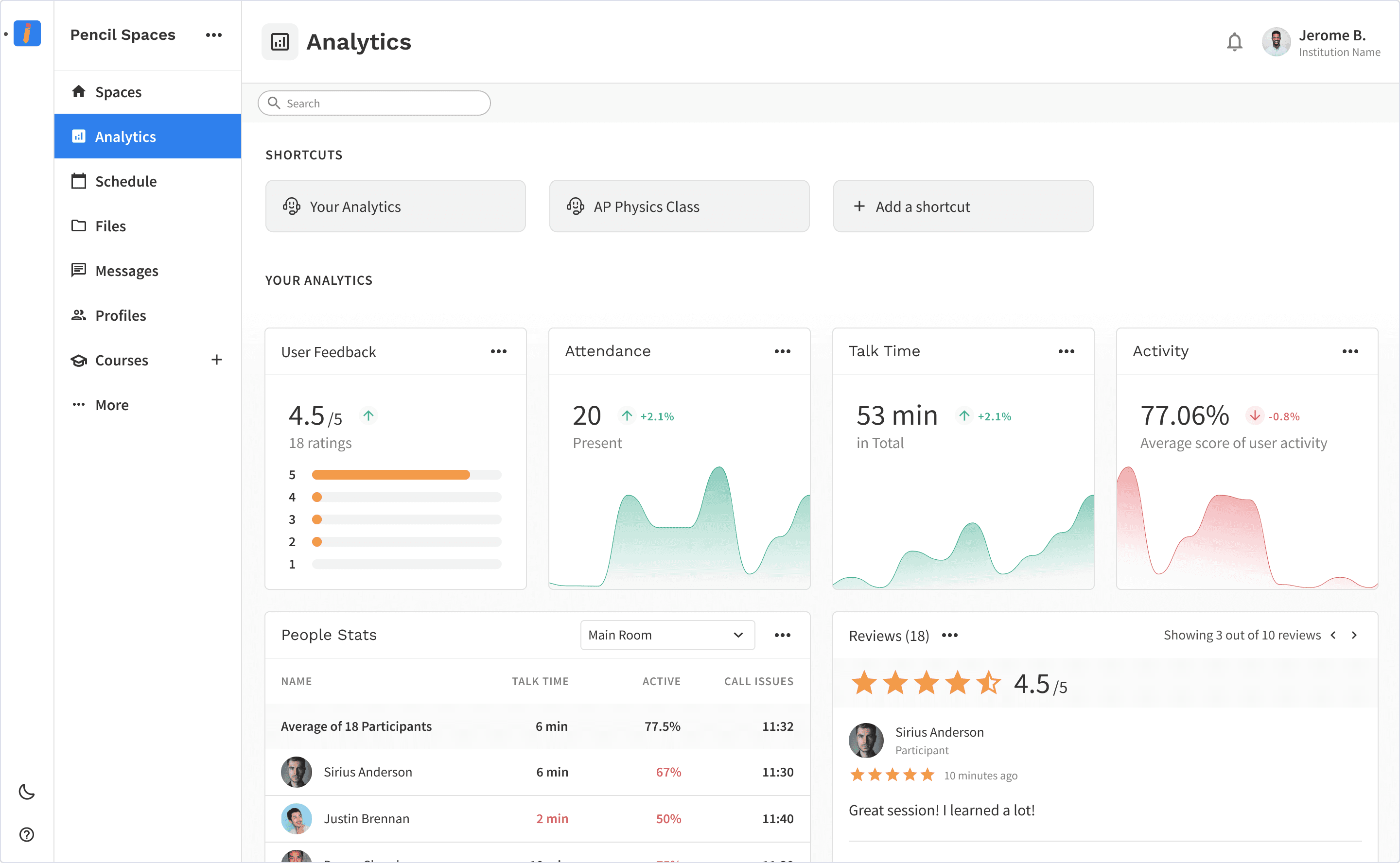
Tutoring companies were using conventional admin tool and video call apps separately to inform their business strategy.

I created a dashboard for these companies to track video call sessions and attendance in order to provide insight about their teaching experience.

This feature was able to close out stakeholder deals, as clients were willing to invest in a product that satisfied their user need.

CONTEXT

Pencil approached tutoring companies as clients

Our business need for the product had to align with the goal of these tutoring companies, or more specifically, with administrators. The goal was to enhance a student’s learning experience.

This manifested into seamless workflows such as scheduling, attendance, user management, and eventually analytics.

problem

Pencil’s breadth of features didn’t give insight

Pencil had all the individual features- but failed to inform admins how students were performing, and ultimately, how their tutoring business was performing

Constraints

Short timeframe: Due to the company being within a competitive landscape, it was important to get the product out as soon as possible.

Short timeframe: Due to the company being within a competitive landscape, it was important to get the product out as soon as possible.

Short timeframe: Due to the company being within a competitive landscape, it was important to get the product out as soon as possible.

Limited resources: As a startup, resources were allocated elsewhere. Therefore, there was minimal investment on user research, particularly user interviews and testing

Limited resources: As a startup, resources were allocated elsewhere. Therefore, there was minimal investment on user research, particularly user interviews and testing

Limited resources: As a startup, resources were allocated elsewhere. Therefore, there was minimal investment on user research, particularly user interviews and testing

Limited to two data sets: Data from the scheduled event (attendance), and data from the session (raised hand and talk time). These two data sets couldn’t be mixed together.

Limited to two data sets: Data from the scheduled event (attendance), and data from the session (raised hand and talk time). These two data sets couldn’t be mixed together.

Limited to two data sets: Data from the scheduled event (attendance), and data from the session (raised hand and talk time). These two data sets couldn’t be mixed together.

Navigation nuances: How can users get from general insights to specific individual analytics without feeling lost?

Navigation nuances: How can users get from general insights to specific individual analytics without feeling lost?

Navigation nuances: How can users get from general insights to specific individual analytics without feeling lost?

💡

The challenge is to create a quick, high-level view of feature analytics that informs users of their business decisions.

solution

Simplicity and structure was key

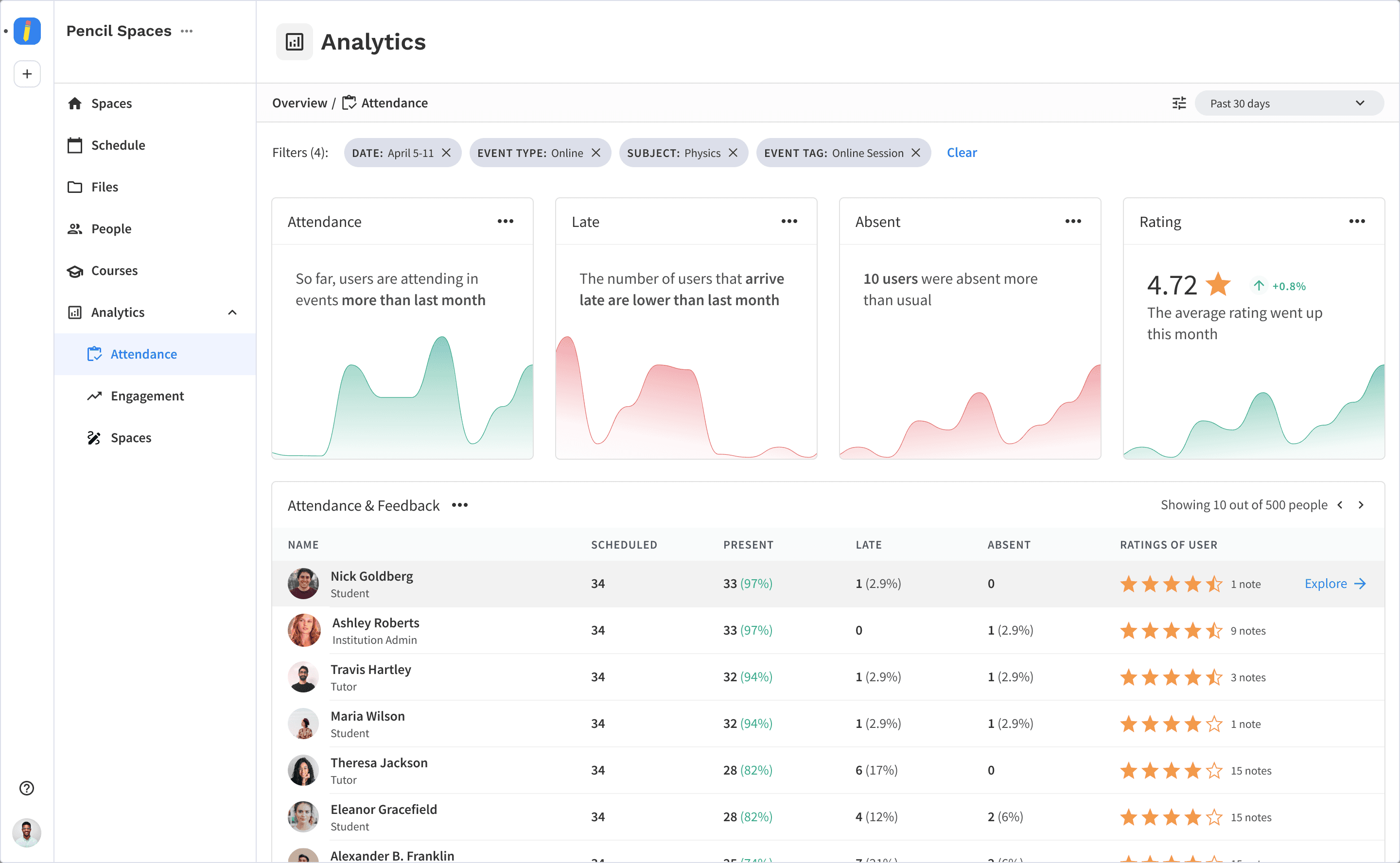
Show what's happening at a glance

  • Allows admins to view insights on attendance or engagement

  • Search and filter through different time frames

View individual reports in a few clicks

  • Admins can view and download individual analytics

research

The Competition had either simple insights, or complex structures

Pencil had more features, and thus data, to organize. There was no simple comparison of Pencil with its other competitors, so I focused on three areas:

  • Student-oriented analytics

  • Industry-standard analytic dashboards

  • AI-powered summary and insights from video calls

Insights

Be intention on what data to show

Though many of the competitors had a wide selection of metrics, the challenge I faced was reducing this selection of metrics to what admins cared about, which was attendance and engagement. This reduced selection was informed from recurring metrics across the competitors.

Outline a simple, repetitive structure for enhanced navigation

Many popular analytic dashboards had a grid-like layout that was customizable and clean. I followed closely to fullstory, where metrics could be divided into three sizes, all of which within a set width and height.

design

Clear specs caused a major breakthrough

With the combination of competitive research and informal discussions, I spent a lot of time defining the content and mind maps, but with no clear endpoint in mind. I recognized what admins wanted, but I was having trouble organizing it for the admin’s needs.

Having a clear set of specifications from my product manager not only simplified my workflow, but reminded me of the business needs of the product, and the end goals of the admin user.

improvements

Checking back to admin user

First Iteration

Second Iteration: Simplify the UI as much as possible

I recognized that admin users don’t want to be overwhelmed by additional actions, or a variety of metrics up front.

Ultimately, admin users can comfortably look at the clean dashboard, and if they want to, can navigate for more specificity

Third Iteration: Redesigning the insight cards for clarity

📌

Graphs are visual, but they can vary in complexity, forcing the user to figure out what’s happening every time

📌

The feedback my senior designer gave was checking Apple’s insights, where they rely on the use of bar graphs and color as strong visual indicators

📌

The third iteration allows admin users to quickly tell at a glance what’s happening

I also added a more defined grid layout to the Attendance & Feedback table for improved scanning

I also added a more defined grid layout to the Attendance & Feedback table for improved scanning

I also added a more defined grid layout to the Attendance & Feedback table for improved scanning

final product

Analytics Dashboard

Individual Tutor Analytics over a month

Individual Tutor Analytics over a month

Individual Tutor Analytics over a month

Event Analytics (created from Schedule) over a month

Event Analytics (created from Schedule) over a month

Event Analytics (created from Schedule) over a month

takeaways

Upon reflection,

This feature was truly a labor of love- although I encountered many setback along the way, I’m truly grateful to be around people who trusted my vision and guided me when it was necessary. Here are the things I’ve learned:

It’s hard to design for the right user. I wish I did formal user interviews, but with the constraints, I ended up doing a lot of the competitive research. This distanced me away from the user, and only through countless feedback from senior designers, stakeholders, and clients, did I eventually create the desired feature for the user.

It’s hard to design for the right user. I wish I did formal user interviews, but with the constraints, I ended up doing a lot of the competitive research. This distanced me away from the user, and only through countless feedback from senior designers, stakeholders, and clients, did I eventually create the desired feature for the user.

It’s hard to design for the right user. I wish I did formal user interviews, but with the constraints, I ended up doing a lot of the competitive research. This distanced me away from the user, and only through countless feedback from senior designers, stakeholders, and clients, did I eventually create the desired feature for the user.

Specs foster discussion and reveal business needs. Since I wasn’t sure of how these business needs manifested, a lot of cycles were made at the start of the design process. I also was far removed from collaboration at the start, and only when I had productive discussions with my product manager did I understand the goals but also the constraints in which I had to work with.

Specs foster discussion and reveal business needs. Since I wasn’t sure of how these business needs manifested, a lot of cycles were made at the start of the design process. I also was far removed from collaboration at the start, and only when I had productive discussions with my product manager did I understand the goals but also the constraints in which I had to work with.

Specs foster discussion and reveal business needs. Since I wasn’t sure of how these business needs manifested, a lot of cycles were made at the start of the design process. I also was far removed from collaboration at the start, and only when I had productive discussions with my product manager did I understand the goals but also the constraints in which I had to work with.

If I could do things differently, I would’ve focused a lot on having formal user interviews and A/B testing. Although general sentiment of the feature is positive, there is user feedback for parts of the feature that could’ve been fixed easily.

If I could do things differently, I would’ve focused a lot on having formal user interviews and A/B testing. Although general sentiment of the feature is positive, there is user feedback for parts of the feature that could’ve been fixed easily.

If I could do things differently, I would’ve focused a lot on having formal user interviews and A/B testing. Although general sentiment of the feature is positive, there is user feedback for parts of the feature that could’ve been fixed easily.

Impact

✍️

The analytics, just in terms of reducing the workload that teachers have to do, in terms of thinking of what lessons to supply next, or making sure students are on the right track and being able to keep track of all that, reducing that workload for teachers and sound directors, and just kind of being able to monitor the progress of students.

  • C2 founder (Client)

✍️

This is obviously a very advanced solution... the analytics and the intelligence that you’ve built into it, I haven’t seen anything like that in any of the solutions we’ve looked at. This is very cool.

  • C2 tutor from a demo (User)

✍️

Scheduling is built-in which allows for automatic attendance tracking, while robust analytics provide valuable insights that inform our instructional strategies.

  • NLG Statement (Client)

Three months after the release of the analytics MVP, usage of the feature rose until it was the second most feature in Pencil

Three months after the release of the analytics MVP, usage of the feature rose until it was the second most feature in Pencil

Three months after the release of the analytics MVP, usage of the feature rose until it was the second most feature in Pencil

Thank you for reading!

More works

More works

More works

Sparky: AI Assistant for Teachers

User Research

Prototyping

User Research

Prototyping

Sparky: AI Assistant for Teachers

View Case Study

Sparky: AI Assistant for Teachers

User Research

Prototyping

View Case Study